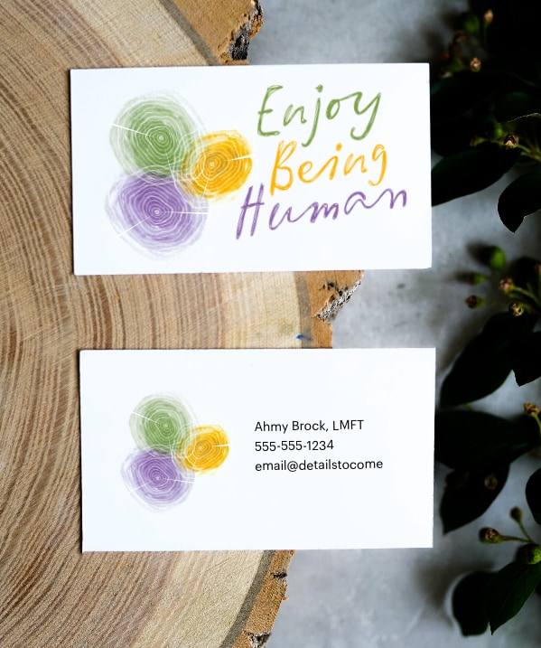
Sometimes creativity is less about using a specific tool, and more about thinking which tools fit the nature of the project. This came true in the story behind my brand design for Enjoy Being Human.
The challenge
When Ahmy Brock, LMFT, decided to help people beyond her New York-based business, she created a Skool.com community. As her reach expanded, I approached her about a unified look to help across other platforms: Skool, her website, print collateral, and beyond. I approached her about a unified look to help across other platforms: Skool, her website, print collateral, and beyond.
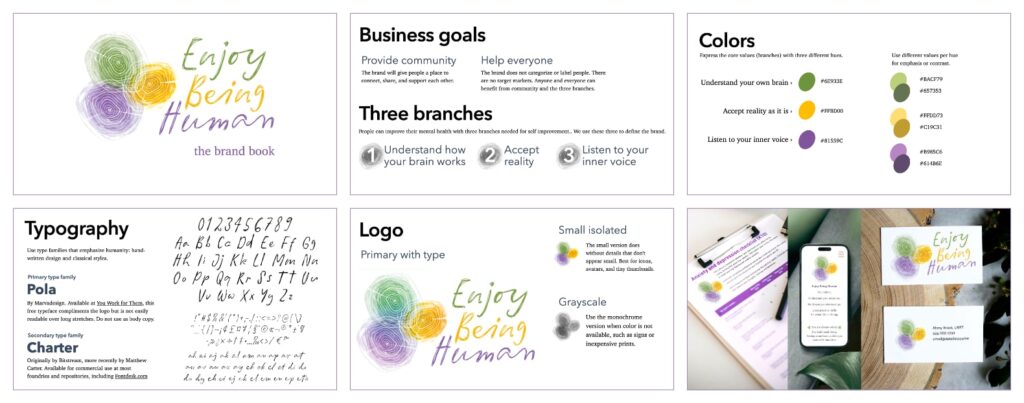
During our Zoom conversation, she explained that previous design pitches felt too sterile, too corporate. She wanted something universal and human that aligned to her motto, “enjoy being human.” She wanted color, life, and three aspects: understand how your brain works, accepting reality, and listening to one’s inner voice. Life is messy, perfectly imperfect.
In practical terms, my deliverables would include:
- High-resolution, reusable assets
- Use three to imply aspects of her work
- Stand out from other, more conservative practices by being human
I prefer to design artifacts like logos and collateral in vectors because they scale to any size without losing resolution. But vector art is based on precise math. Even though tools like Illustrator let us change behind-the-scenes calculations with an intuitive digital interface, the fact is, they’re still computer-generated lines … and it shows.
The process
During our call she told me that all people can benefit from community, and didn’t want to target any one group. We also discussed her existing site and material, mostly generated with Canva. Thinking about the human aspect of her work, I changed angles and asked about the nature art on the walls of her office. That led to several ideas.
I developed two tree-themed concepts. We agreed that one was too perfect and generic. But the other, based on tree rings, had potential. Tree rings represent growth. Overlapping rings suggest holistic thinking. With the right touch, tree rings might resemble fingerprints.
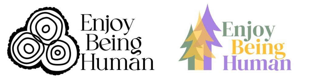
There was an immediate problem: the art was too clean. Even rugged “bark” was simulated, and it showed. The client correctly pointed this out, and after thinking about how to make vector art “messy,” like hand-drawn art, I did the obvious and began working on pad and paper. Sketching is good for quick mockups, but this time I decided the final art would use real drawings from real sketches.
There was another problem: The illustrations looked more like blobby circles than tree rings.
I researched tree rings by searching stock photo sites and examining lumber in person. Some rings are subtle, others are obvious, depending on the type of wood. But what defined them all were the narrow cuts that ran in straight lines from bark to core. So I explored ways to add cuts with transparent tape on paper, and later digital vectors.
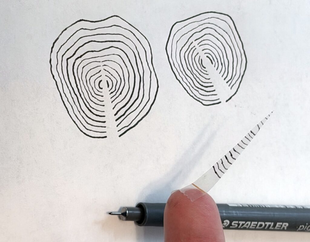
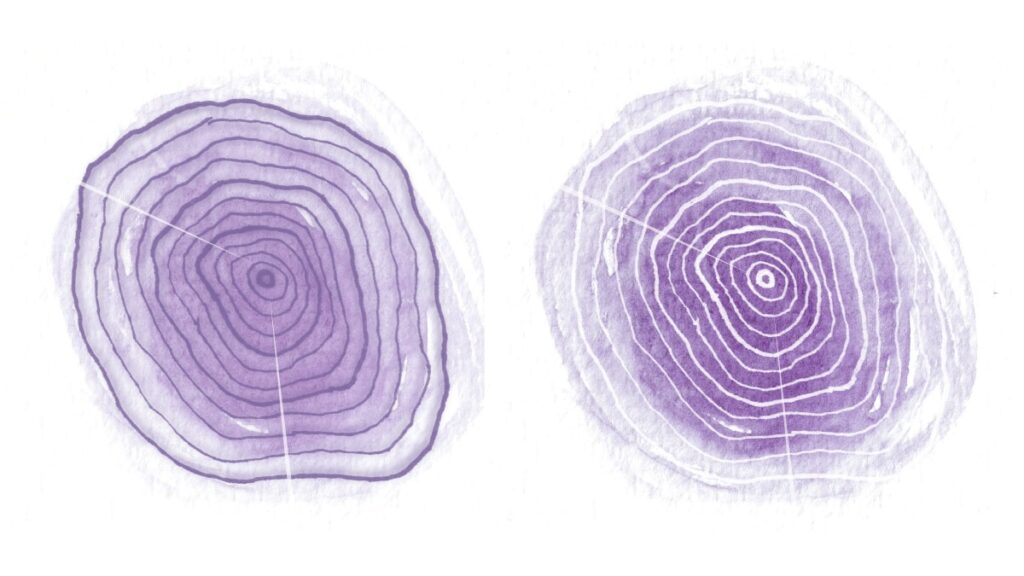
For the next round I hand-drew tree rings with different pencils and pens. After some tests I settled on Staedtler pens 0.1mm and 0.3mm thin. I used water color to paint texture on separate paper. Then I scanned each piece at 600DPI so they would scale well. Scanning them independently let me color independent parts.
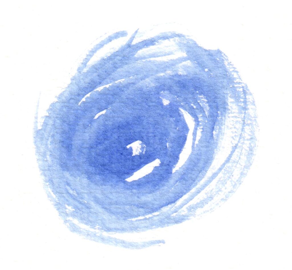
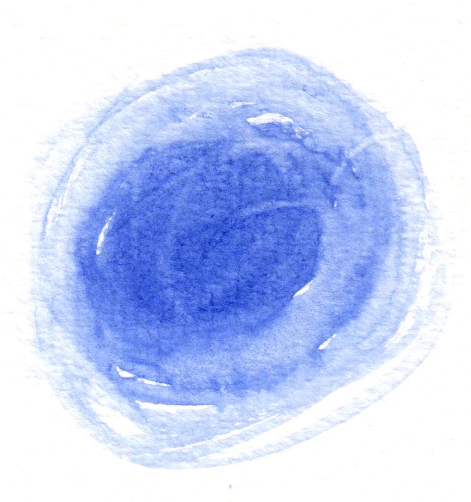
Experimenting with opacity and color, I found a solution that kept the tree rings legible, implied overlapping aspects, and didn’t muddy the middle. My handwriting didn’t make the cut, so I found a typeface that complimented the look: Pola Words by Marvadesign. I also tested the shape to make sure it worked when used small, and checked its silhouette to see if it stayed distinctive. Logos that depend on textures don’t always survive these tests, but for my client’s goals they worked well enough.
The result
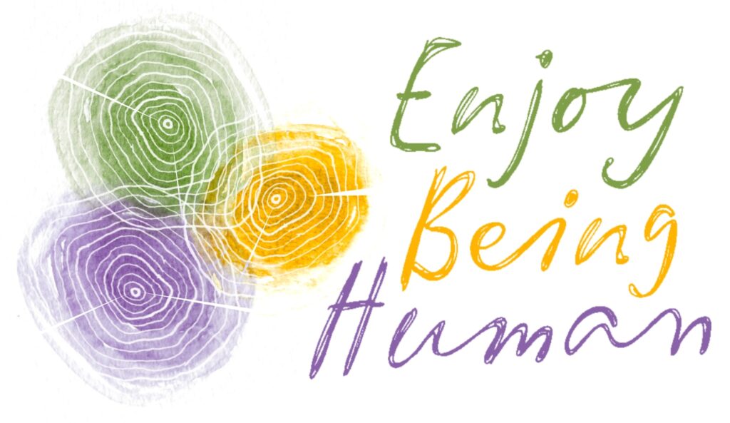
The final products were a high-resolution logo image and simple brand bible, including color scheme, typeface, and usage guidelines.
The colors aren’t perfect. The texture’s gritty. It’s not a scalable vector. But the final product is messy, like life; unique, like the client; and attention-grabbing, like a good logo should. You might even say they it’s perfectly imperfect.