From 2018–2025 I worked for Tata Consultancy Service as a Content Strategist. My group’s specialty was analyzing corporate content for migrations and upgrades.
When moving, merging, or redesigning corporate websites, clients must decide which pieces to not transfer and how to restructure or reformat what remained.
I developed a system for crawling sites and making content inventories understandable. That is, I turned spreadsheets into infographics.
- Invented a visual language to reveal content distribution
- Developed a repeatable process for quick turnarounds, sometimes within hours of being asked
Result: Designers and managers could see the scope of content challenges and plan accordingly to save time and plan effort.
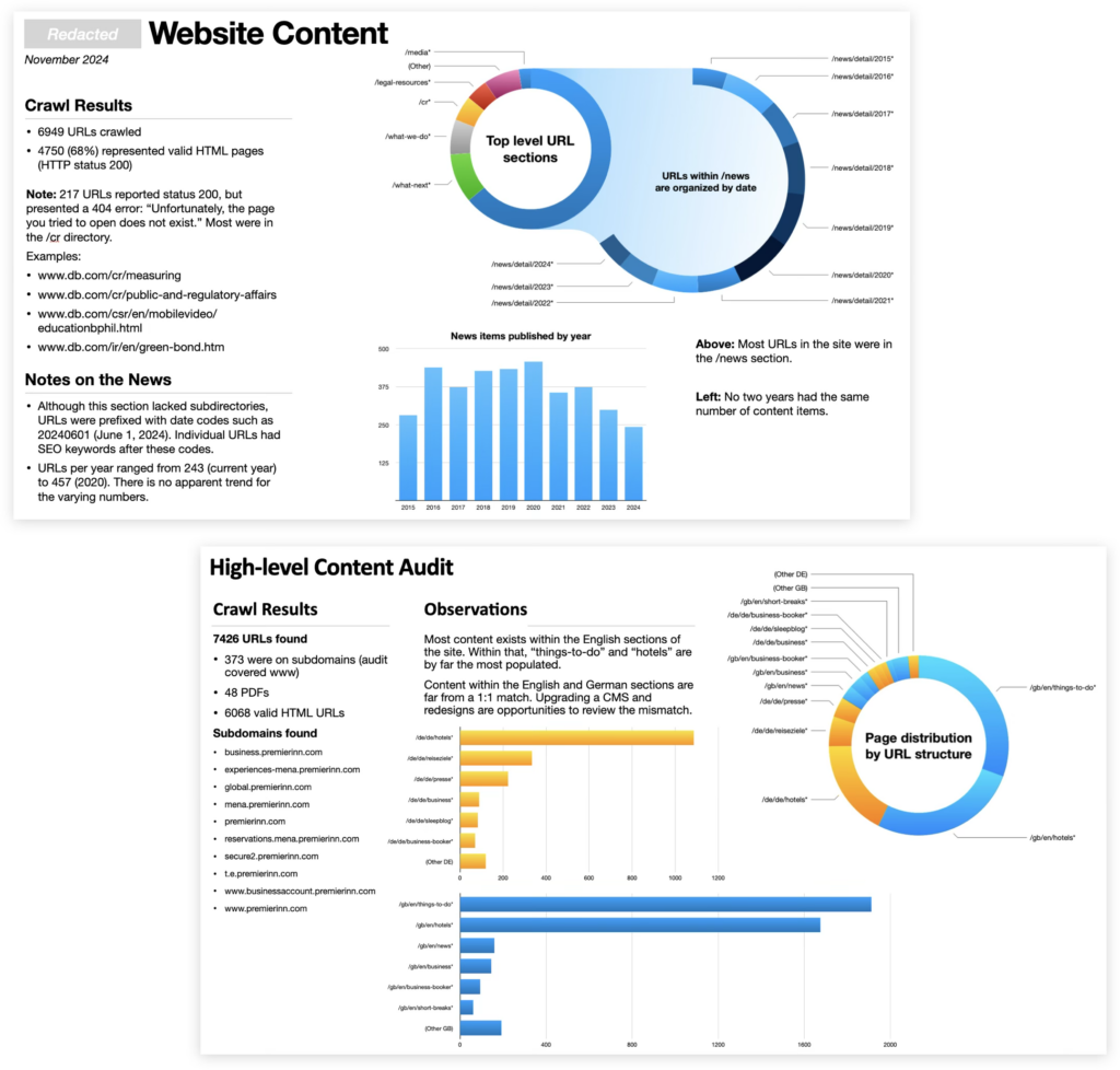
The visuals called attention to which parts of a site contained the most (and least) content. Understanding this distribution helped project managers set priorities per content type, which kinds to migrate/merge with automation, and give clients accurate time estimates.
Discoveries made from these visuals became conversation starters among project teams and pitch points for sales people.
Several times per year I was asked to elaborate on sections, produce more detailed analyses, or re-crawl sites to produce fresh insights with my unique process.
My approach worked in three phases.
- First, I developed processes to parse data from scrapers such as Screaming Frog and Lumar.io.
- Next, I dug into the data for heuristic evaluations — that is, I looked for problems beyond generated statistics.
- Finally, I produced graphics unique to each project’s needs. The style evolved over time as I invented ways to dive further into digital content.
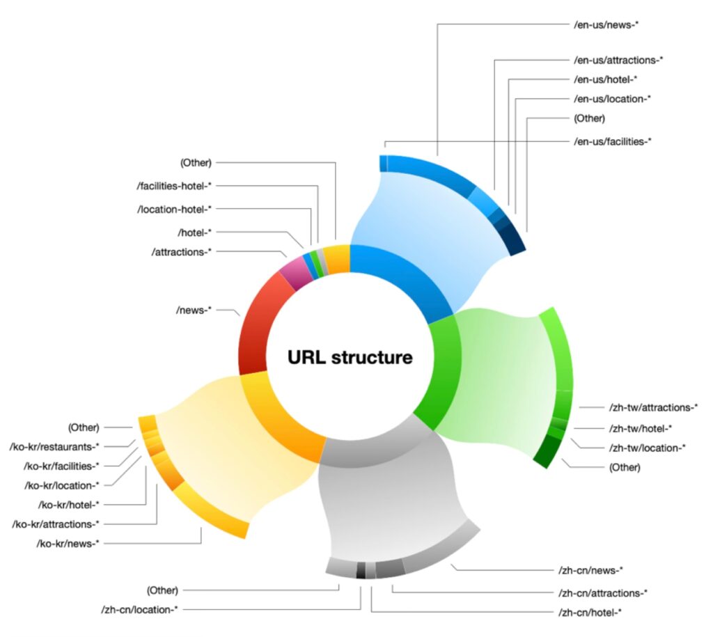
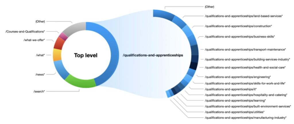
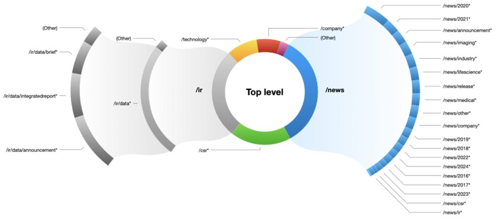
As seen here, this system worked both on overall sites and when we wanted to examine a particular section of a site.
Visualized spreadsheets
Not every client resonated with presentations. Some preferred to get their hands into data, which is one reason I developed custom spreadsheets with visual cues.
In this example, each column represents a regional or product website scheduled to merge into one corporate site. Each cell represents a unique URL.
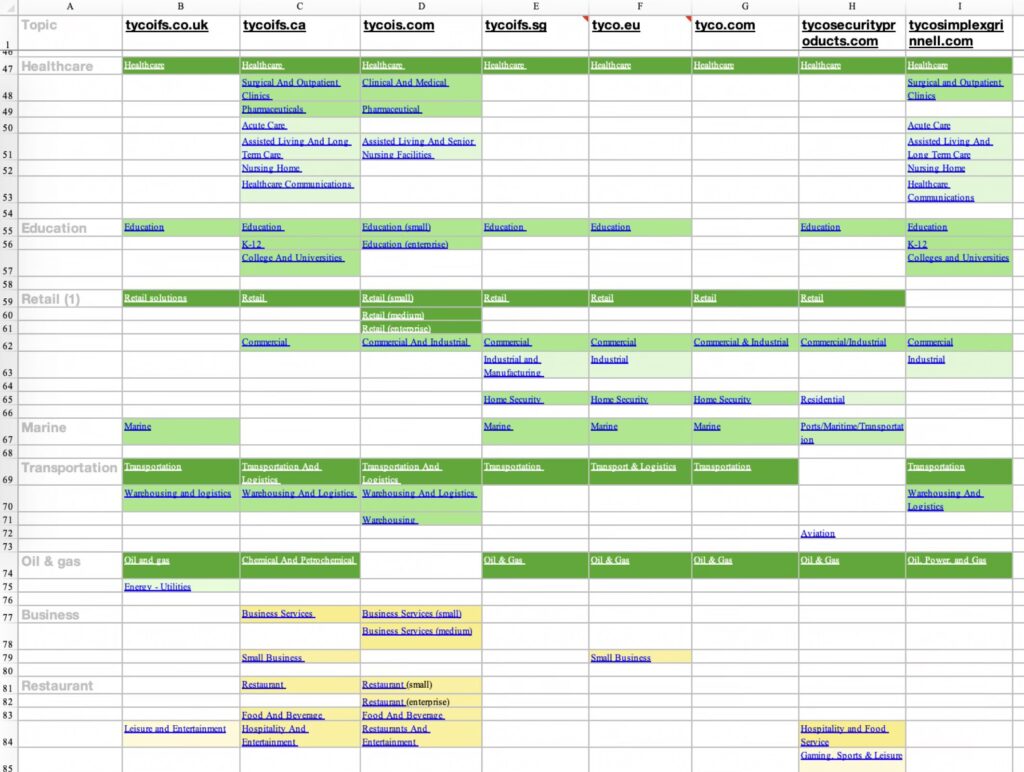
- Dark green cells are exact matches, which I used to show how we could save time during the migration.
- Light green cells are similar, possibly copied with regional variations.
- Yellow and pale yellow cells are related topics but unique content — likely targets for copywriters to integrate or rewrite.