Pen & Pier is a fiction writing group that meets in person, but announces events through the chat program Discord.
But announcements and reminders were easy to overlook among conversations. Tagging @everyone was obnoxious. How could we get attention, convey vital information, and not annoy people?
To solve that:
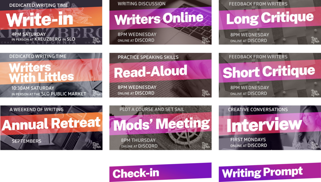
- I created a series of graphics designed to get attention without dominate conversations.
- I used colors to indicate online video vs in-person events.
- I used size to indicate informal but regular chat events.
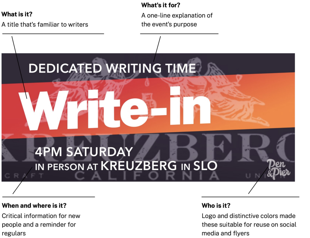
Knowing that people would start to develop “ad blindness,” I emphasized the simple titles with large, slightly-angled text and bold colors. I was careful to make the secondary information small — but still readable in at a glance. The goal was to provide critical time/date/place event information to new group members, while alerting regulars who just needed a reminder.
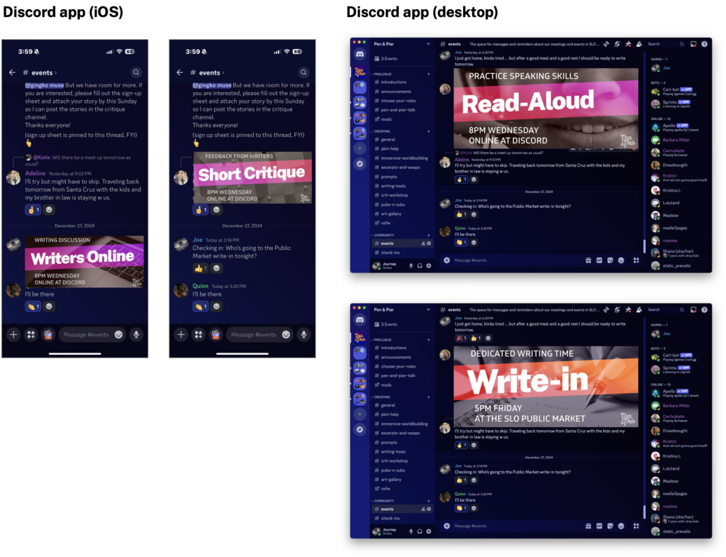
Here are examples of the graphics in Discord. The goal was to get attention with a recognizable look, then allow conversations to move on.
- Visual height balanced between “big enough for vital info” and “small enough to scroll away.”
- I used colors as organization tools, creating categories with hues.
- The messages contained only vital information, making them welcome reminders instead of interruptions.
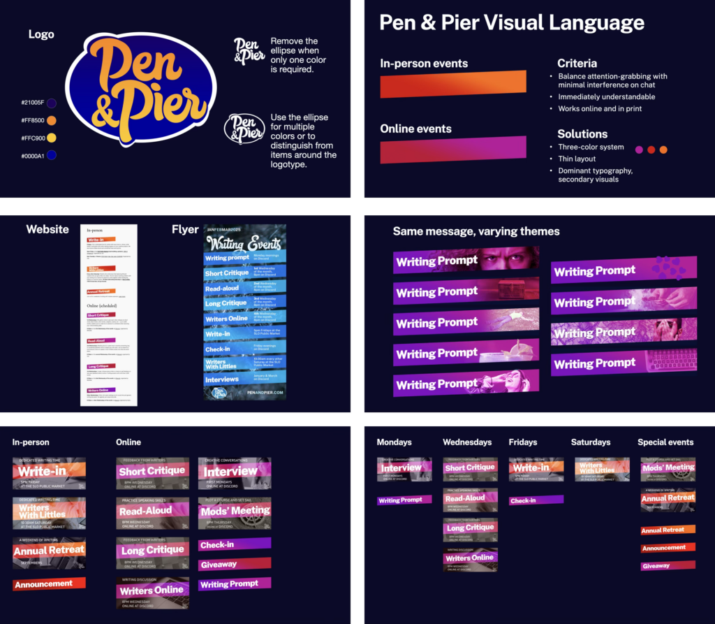
By repeating the style with variation:
- Regular members could overlook the specifics they didn’t need
- Hues implied tertiary information, such as which events were online or in person
- We stayed flexible enough to create new events for specific needs
- We could discontinue old events or modify details if venues changed along with official announcements.